Universal Symbols

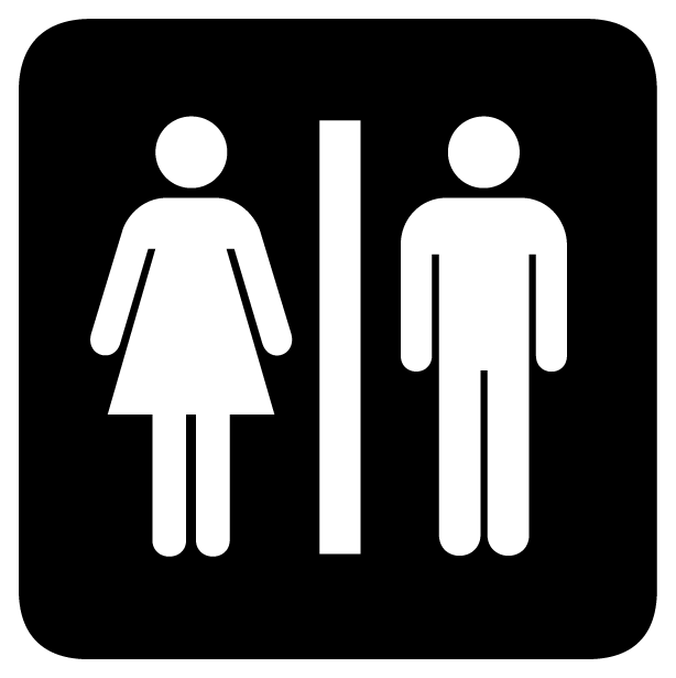
After working with icons in class for the past week, I started becoming more cognizant of the everyday icons I see in my day-to-day life. I was interested in looking into how these universal symbols for restrooms, restaurants, and airports came about. Through my search, I stumbled on this Atlas Obscura article, which described how the American Institute of Graphic Arts (AIGA) was approached by the Department of Transportation (DOT) to create informative symbols that could help direct traffic during the U.S.'s Bicentennial celebrations. After a long and iterative process of creating, designing, and editing these icons, AIGA and DOT eventually released the symbols that we now see all around us today. What stood out to me about AIGA's design process was how much it reflected our own class' process for creating futuristic signs. As the article states, "creating simple, easily understood symbols required that the designers grasped the essence of what they were trying to communicate." They even called the male figure in their signs "Helvetica Man," because of its clean, no-frills appearance. AIGA was successful because they were able to cut down to the bare fundamentals, keeping just enough detail to convey the message they were trying to deliver.
Very relevant to our current assignment. "Helvetica Man!" 🅰️🚹
ReplyDelete